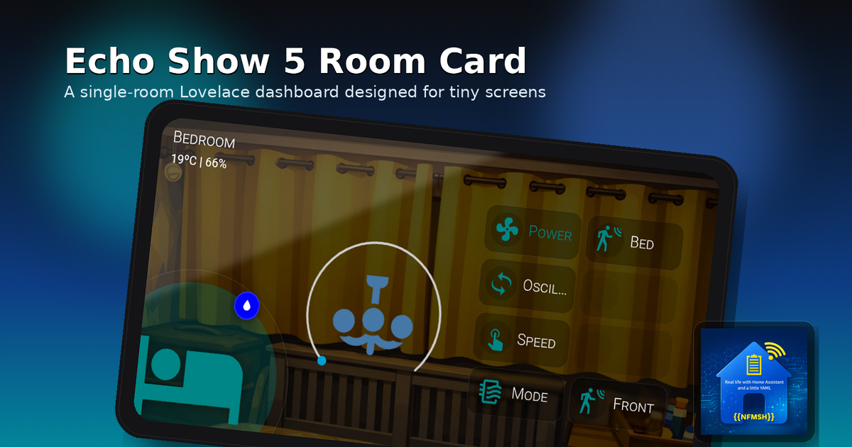
Echo Show 5 Room Card: A Single-Room Dashboard for Tiny Wall Screens
A Home Assistant Lovelace custom card designed for Echo Show 5 displays with a room-first layout, center control slot, and configurable action buttons.
If you’ve been hanging around the Home Assistant world lately, you’ve probably noticed a trend: Echo Show 5 units are becoming mini dashboard screens. Between the jailbreak progress and the ability to run LineageOS on them, they’ve suddenly turned into a neat little “cheap wall display” option.
And that’s where my brain did the thing it always does: it saw a new form factor… and immediately started arguing with Lovelace layouts. 😅
Most dashboards are built like full control rooms: multiple cards, multiple columns, lots of context. On a small display, that quickly becomes tiny text + tap targets from another galaxy.
So I built something different:
The idea
One card = one room dashboard.
A single view that’s readable at a glance, touch-friendly, and looks intentional on a small screen.
That’s the goal of my new Lovelace custom card:
Echo Show 5 Room Card (
custom:echo-show-5-room-card)
It’s available via HACS (Frontend), and it’s designed to shine as a panel view (single-card display).
What it looks like
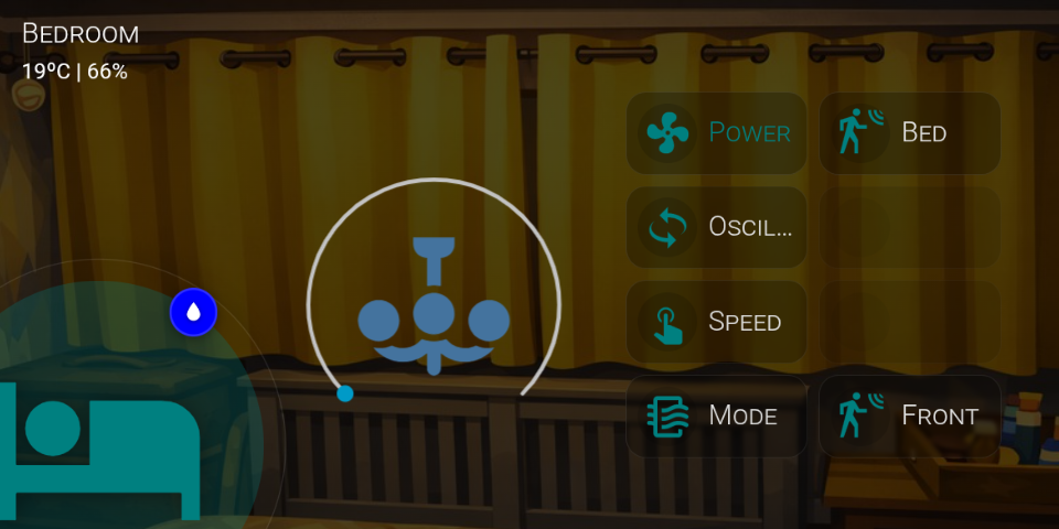
The layout is deliberately “room-first”:
- Top-left: Room name + subtitle (typically temperature + humidity)
- Bottom-left: A big room icon with a halo
- Badge: A static badge that changes icon + colour based on your temp/humidity thresholds (badge icon stays white)
- Center: A main control slot (thermostat / light / media / etc.)
- Right: Up to 8 action buttons in a fixed 2 columns × 4 rows grid
The design goal is simple: it should look clean whether you configure 2 buttons or all 8, and it should never “break” the layout.
Why it works well on Echo Show style displays
Under the hood, the card renders a fixed 960×480 “stage” and scales it to cover the container. That means you get predictable positioning and proportions, without constantly fighting responsive CSS across random display sizes.
In other words: the layout stays consistent, and the device just becomes a window into it.
Features (the useful bits)
Background + overlay
- Optional background image
- Configurable dark overlay so text stays readable even on bright photos
Header styling
Because backgrounds vary wildly, you can configure:
- Title text colour and font size
- Subtitle text colour and font size
Main icon + halo
- Big icon bottom-left
- Halo follows whatever your main icon colour is (no hard-coded teal)
Static badge (fixed position)
- Badge is fixed in place (intentionally not user-movable)
- Badge circle colour changes based on thresholds
- Badge icon changes, but stays white
Center control slot
You can choose:
- Preset + entity (easy mode): thermostat, light, media-control, fan, generic entity
- Or advanced mode: pass a full
center_cardconfig
Extras:
- Center background forced transparent so it blends into the design
- Optional hiding of the “more info” dots on the embedded card
- Light preset supports scaling (I’m using 1.25)
Buttons (up to 8)
- Fixed grid: 2×4 slots
- Per-button:
- label
- icon (picker)
- icon colour
- label text colour
- entity (optional)
- tap action (toggle / more-info / call-service / navigate)
- Empty slots don’t show outlines (no dotted “ghost buttons”)
Recommended setup
This card is happiest as a panel view, so it fills the screen cleanly:
1
2
3
4
5
6
7
8
9
10
views:
  - title: Bedroom
    path: bedroom
    panel: true
    cards:
      - type: custom:echo-show-5-room-card
        title: Bedroom
        background_image: /local/images/bedroom.jpg
        env_temp_entity: sensor.bedroom_temperature
        env_humidity_entity: sensor.bedroom_humidity
Optional: Browser Mod for kiosk vibes
The card itself doesn’t require anything extra.
But in my setup, I use Browser Mod to:
hide the Home Assistant header / UI chrome
make the display feel more “kiosk-like”
If you’re building a wall display out of a Show 5, Browser Mod is a great companion.
Inspiration / credit
This card was inspired by Aguacate’s Room Cards concept:
https://aguacatec.es/room-cards/
Where to get it
HACS (Frontend)
Repo: https://github.com/nfmsh/echo-show-5-room-card
(Once it lands in the HACS default store, I’ll update this post.)
What’s next
This is the first release, and I’m planning to iterate based on real-world use. If you try it on an Echo Show (or any small wall display), I’d love to hear:
what devices you’re using
which center controls look best
what you wish the editor did differently
If you want to follow along (or file issues / feature requests), the repo is the best place to do it.
Thanks for reading, and happy dashboarding 👇✨

